Whether creating, reinventing or refreshing a team’s, facility’s, event’s or product’s identity, it pays dividends to invest time and effort in a systematic and objective approach. Shortcuts have paved the way to a mortuary of missed opportunities and costly mistakes.
Here is the process we used building the San Jose Sharks identity and what we learned about how to capitalize on the best practices of consumer-driven industries worldwide.
● Put someone in charge who has strong project management skills and experience managing the creative process. Then EVP Business Operations, I was assigned responsibility for developing the team name, logo, uniform design and colors by Art Savage, President & CEO.
● Build a multifunctional team that understands the customer and is comfortable with experimentation and open to alternatives. We forged a team of freelance talents (rather than delegate the project to one outside agency) to develop the NHL’s first “family” of logos and logotypes, i.e., a primary crest (the shark biting stick treatment), a shoulder patch (the stylized fin), the serrated tooth typeface and an alphabet of its own (Triangle Gothic). Among the four designers engaged to develop the logo family, Terry Smith eventually delivered the final executions of the crest and shoulder patch logos and Mike Blatt delivered the serrated tooth typeface and alphabet.
● Secure segmented customer feedback. With the name having been selected through a rigorous process, extensive qualitative and quantitative marketing research (more than 900 adults, teens and pre-teens) was carried out with hockey fans in the bay area who evaluated different types of sharks treatments, color combinations and uniform designs.

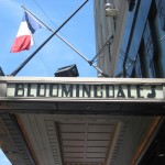
 The opinions of L.L. Bean, Bloomingdale’s, J. Crew, Neiman Marcus, Starter (then an NHL apparel licensee) and Sharks Director of Merchandise Marketing, Mary Keen, were also sought to recommend the shade of blue that would be employed to deliver the “Sharks” sea name. Hence, the selection of what we dubbed “Pacific Teal”.
We learned that while teal appealed to women, men found it equally engaging when combined with black. It was also a sensitive dance to create a design package that excited teenagers yet didn’t turn them off when they saw their pre-teen sisters and brothers wearing it.
We also had to deal with push-back from the uniform manufacturer’s president who wrote me a formal letter asserting, “No hockey team in the world uses teal; just use one of the other shades of blue being used in the NHL like the ones used by the Rangers or Blues. It will be costly for us to develop all new yarns.”
There are now online tools available to make the range of options more comprehensive, the feedback more textured and the analysis more efficient.
● Establish selection criteria for the logo. Ours for the primary crest included: (a) deliver the ferocity (NHL approval was initially tentative) and the fantasy of the shark in a manner that would appeal to players, adults and children (very different audiences); (b) suggest action and depth/dimension (all other sport industry logos had been flat and two-dimensional) and (c ) incorporate symbolism of the “red triangle”, the area from Bodega Bay to the Farallon Islands to Monterey, the habitat for 11 species of shark, as we learned from Dr. John McCosker, Chair of the Dept. of Aquatic Biology at the California Academy of Sciences in San Francisco.
● Make a fact-based case to the final decision makers(s). The authorization to proceed with the primary crest logo was made by owner George Gund and Art Savage when I presented final recommendations at Alioto’s restaurant on Fisherman’s Wharf in San Francisco late one night after closing. Gund was especially drawn to the spirit of creating a logo that broke with sports industry tradition and had no precedent , one surrounded by a supportive design “family” that was a metaphor for excitement and innovation. (The waiters and bus boys who had to stay late while we reviewed alternative treatments wondered what was going on!)
***********************
All of this preparation is wasted if the introduction of the identity package is traditional and localized. Our launch included the following elements:
- An on-ice press conference at a regional ice rink, with stands erected on the ice for 300 invitees, randomly selected entrants in our name-the-team sweepstakes
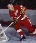
 The lure of hockey world icon Gordie Howe skating onto the ice with our owner George Gund wearing the new home and road jerseys
- An on-ice multi-generation fashion skating show, featuring our logo family on 20 different licensed apparel items, choreographed by Alysse Soll, our Director of Community Development, a formal international figure skating competitor and hockey player at Cornell University.
The mystery build-up and the appearance of Gordie Howe led to an 11-camera TV coverage turnout which made the event into a global media event. It was featured that night on evening sports newscasts through North America and Europe.
 In fact, ESPN selected it the “NHL Play of the Week”.
When Sharks merchandise hit retail, we were not strangers.